Fitted
A UI Case Study on an exercise companion app
Quick Demo Video
Objective: Health is not just working out. It’s a complex combination of movement, meals and motivation. How do I create a companion app that encompasses all these aspects in one place? Fitted will be the mobile-first app that will meld all aspects of health into one.
My Role: End-to-End UI/UX Designer
Skills: Wireframing, Prototyping, Animation
Tools: Adobe CC; XD, Illustrator, Photoshop
Duration: 2 months.
I’ll create a companion app that’s ready to tackle all aspects of health.
WHO’S IT FOR?
People who are new or returning to fitness, want to find activities they like, and get into a good routine will be interested in Fitted.
Their Stories, their wants.
● As a new user, I want to learn about different exercises, so that I can figure out what is best for me.
● As a new user, I want to be shown how the exercises are done, so that I know I’m doing them correctly.
● As a frequent user, I want to be able to schedule exercises for working out, so that I build positive habits.
● As a frequent user, I want to be able to earn achievements or rewards, so that I can stay motivated.
● As a frequent user, I want to complete daily challenges, so that I can have an additional way to stay motivated.
● As a frequent user, I want to track progression and record what I’ve done, so that I can see my progress over time.
● As a frequent user, I want to be able to share routines with my friends who may also be interested, so that I can encourage them to become healthier.
I know who and I know why.
Now let’s find out how.
The Primary Tasks
We want the core features of our app to hit each main task our users want to complete.
“As a frequent user, I want to be able to schedule exercises for working out, so that I build positive habits.”
“As a frequent user, I want to track progression and record what I’ve done, so that I can see my progress over time.”
“As a new user, I want to learn about different exercises, so that I can figure out what is best for me.”
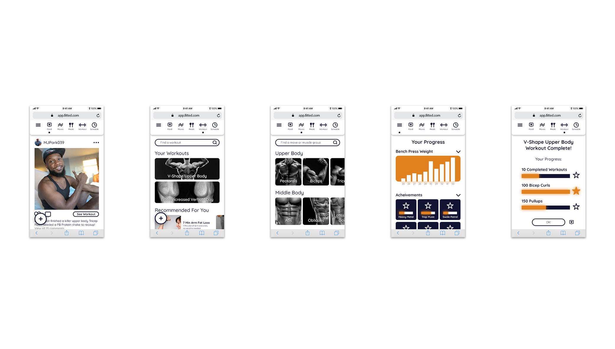
User Flows
I have to distill each Primary task to a User Flow, ideally making them as simple as possible on inception. Each task will inevitably become more complex with more features and requirements. So its crucial at this point to have be as easy as possible.
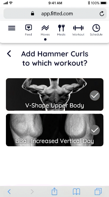
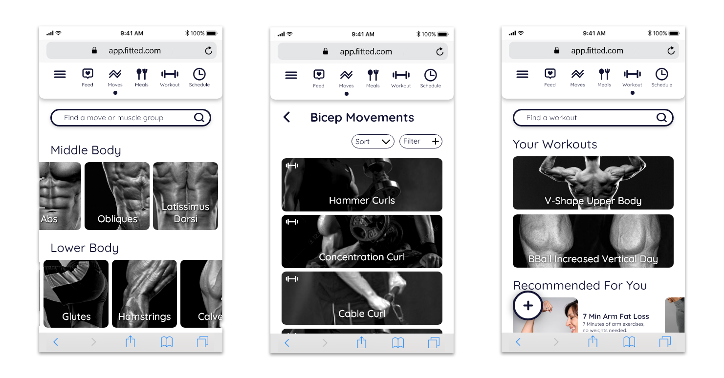
Schedule Workout
User flow for scheduling a workout.
Hand drawn sketches in Illustrator for the Scheduling User Flow.
Using my sketches, I created Mid-Fidelity Wireframes. For this flow I leaned into making the it even more simple. Although in the final prototype, you’ll see that I’ve found a middle ground between the overly simple and overly complex.
The prototype and my ideas have been evolving from this point, I was removing and adding things until my users stopped running into any usability errors.
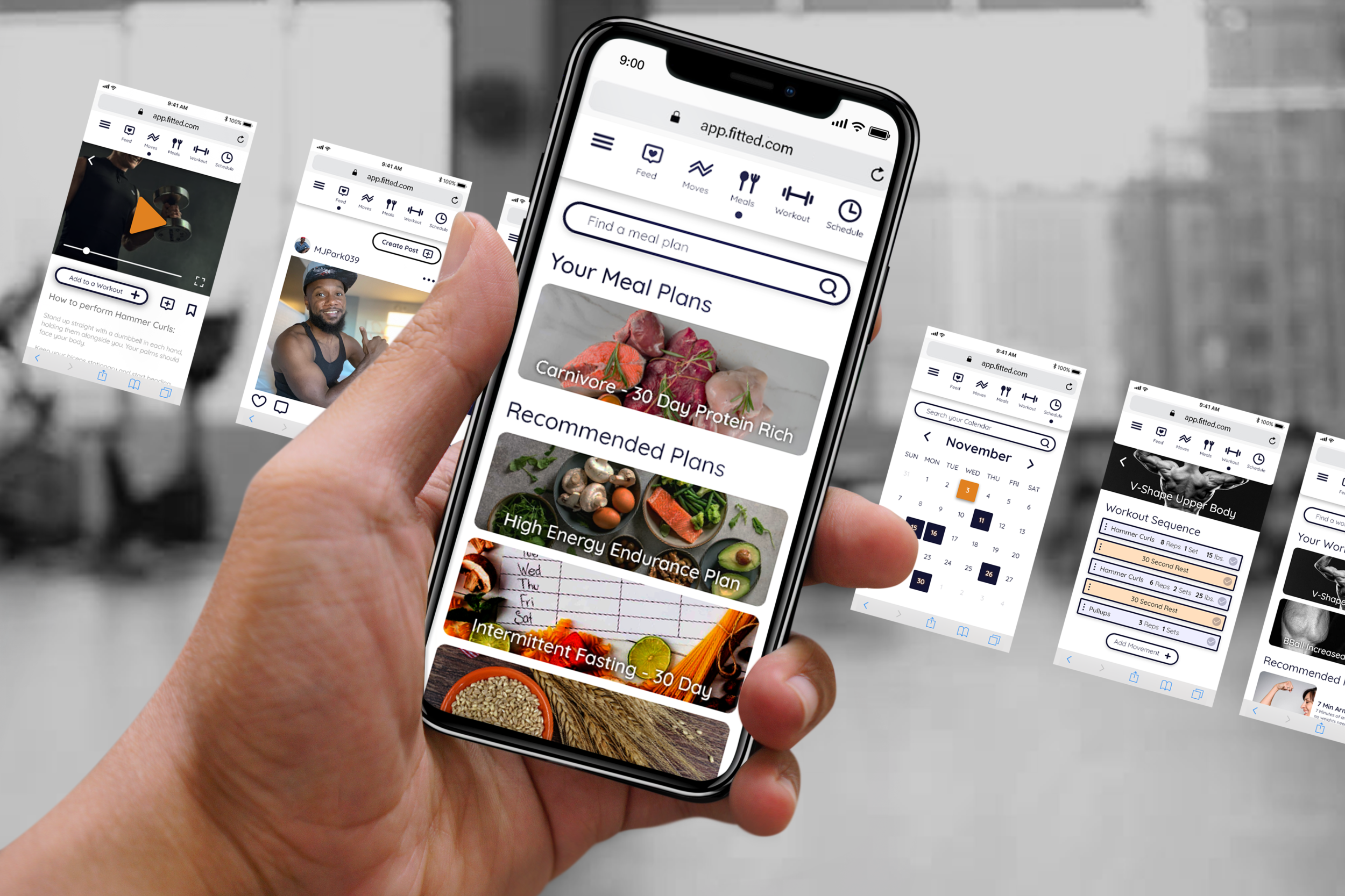
Aesthetics
The color requirements in the Project Brief for Fitted emphasized Orange and Black as the colors, along with the descriptors “Easy, Informative, fun”.
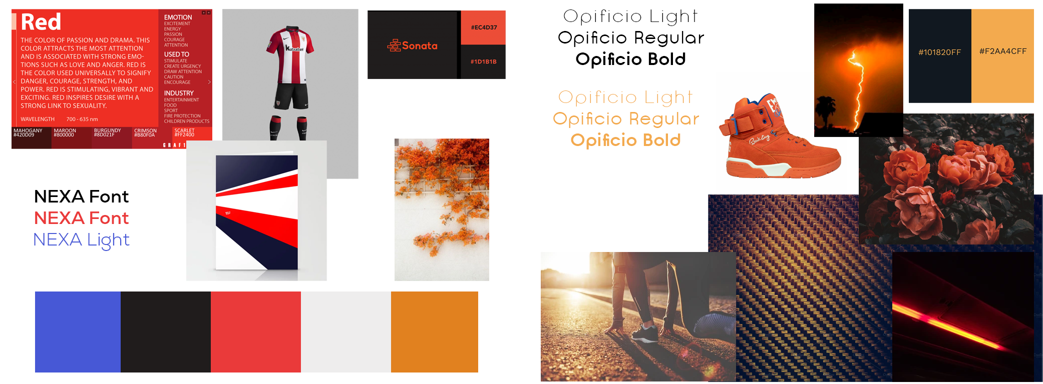
Two different mood boards, with two potential Font Families.
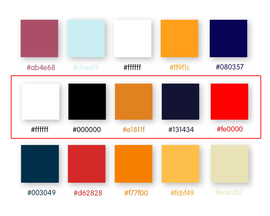
I created 3 color palettes for some variety, and maybe some surprises.
I chose the second palette above, since it had black, orange and a very dark blue.
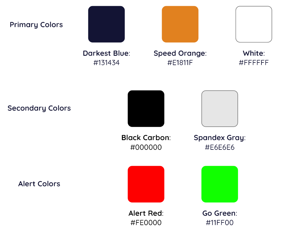
The Style Guide
Starting with a finalized color palette, I built my UI around every color in this scheme. Now I could build a guide for myself as I created more screens, and eventually build a color language/rosetta stone.
Darkest Blue, Speed Orange and White were the core colors of my UI. I could build every screen with these 3.
Typeface

Quicksand was the choice for Fitted. Its rounded, sans serif fonts offer a little playfulness without looking too silly or childish.

I created a button hierarchy, with the dark blue outlined button as the workhorse button, with the secondary and tertiary buttons in tow.
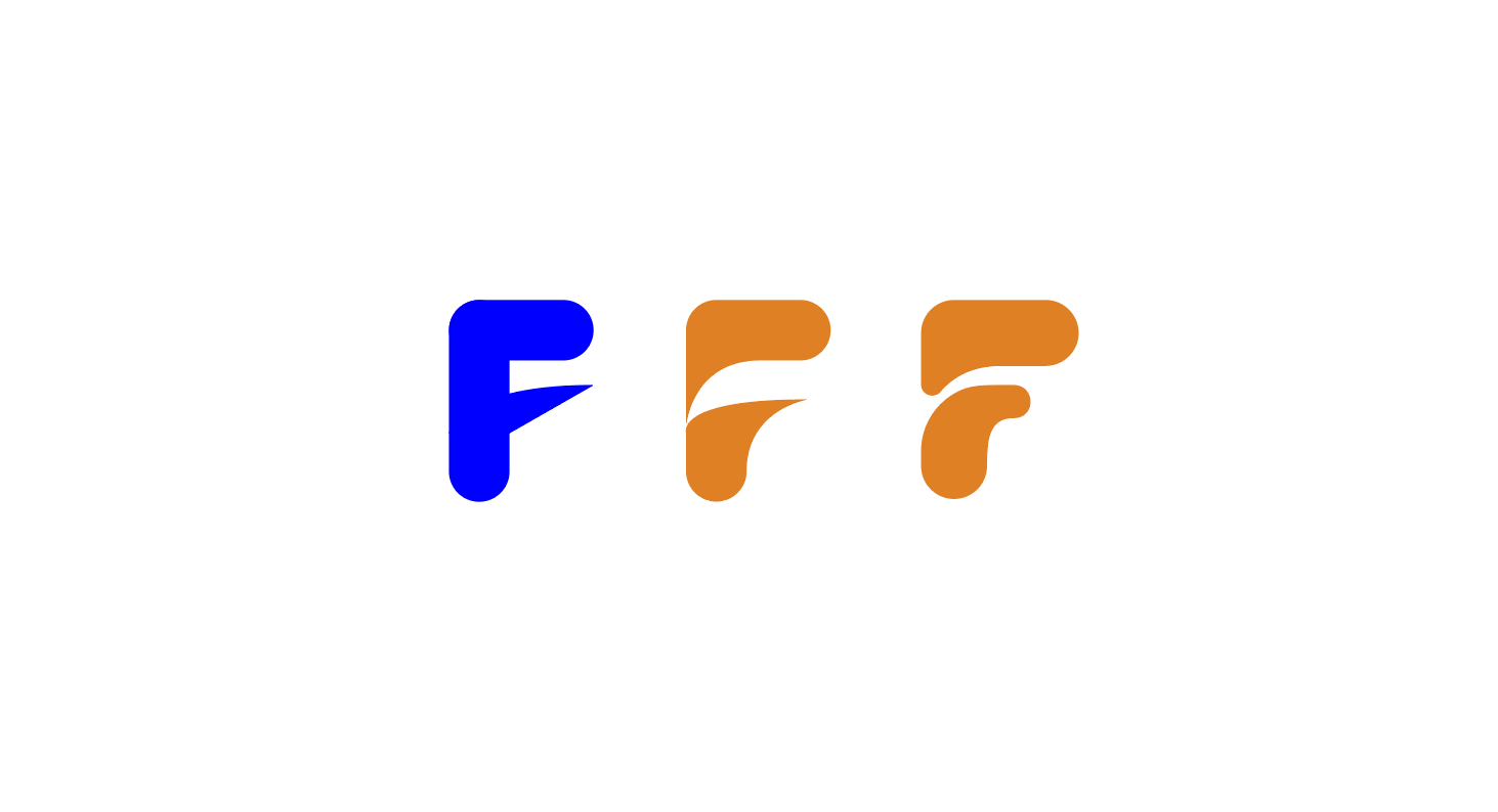
Logo
It took 3 iterations to get the Fitted logo. The final logo gets rid of sharp points to be a little more playful.
As the style guide grew, new requirements and recommendations came through, so I could keep a dependable visual language for the User.
Color Iterations

My first iteration of the colors in the UI held tightly to the color scheme I picked in the beginning. However there were two problems with this color scheme; Red can be too alarming on the eyes in this color scheme, and the Orange I’ve used may not read clearly on white.
So I went with my gut and reduced the color usage per page within the UI itself.

Colors as status
I didn’t want to place colors down just to make the current screen look good by itself. Each screen needed to be familiar to the one before it.
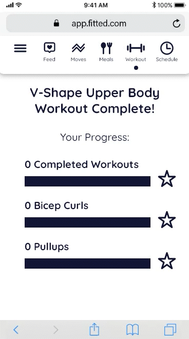
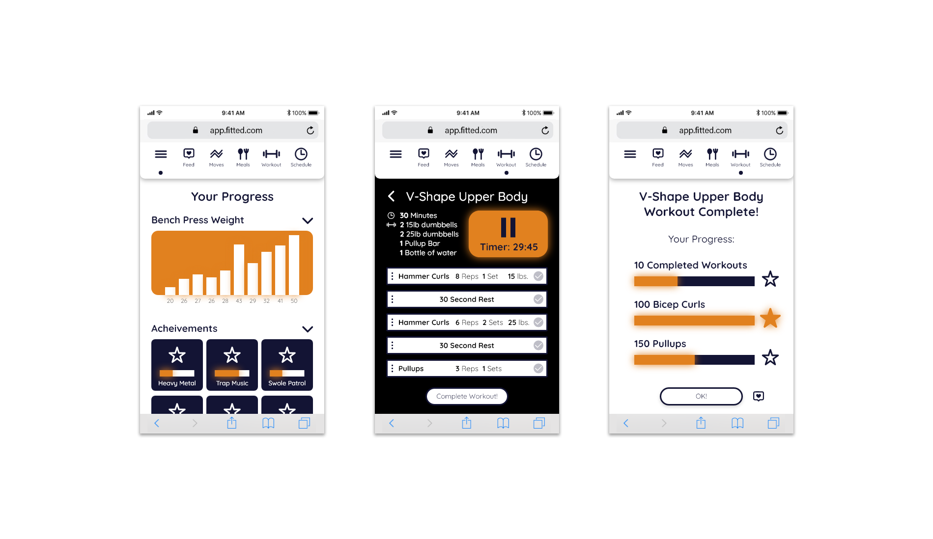
As I was building each screen, I noticed my main process was to start with a white background then dark blue elements making the majority of UI coloring, and orange as status elements! I enjoyed using orange for progress bars, stars, play buttons and achievements. This became the visual language I was talking about before.
Iconography
All iconography was made in Adobe Illustrator, a mix of hand drawn and pen tool objects. Line widths had to be as similar as possible except when a line width would obfuscate an icon’s meaning in a different scale.
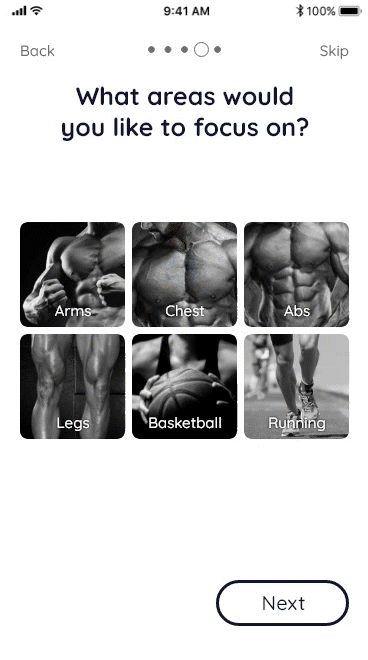
Imagery

I used Black and White imagery for the body part images and wanted to make the user feel like these idealized body parts are theirs. To help emphasize that, I took imagery that doesn’t have the subject looking at the camera.
Animation
With my background in animation and game development, I am able to make animations within XD to give Fitted that extra juice! Completing workouts, seeing your progress, reaching achievements, and creating new content should be accompanied by animation.